Today, we're launching a ready-to-deploy toolbox for iOS apps. It includes:
- Notifications to improve day-1 retention and reduce churn.
- App rating prompts that appear at the perfect moment.
- Increase revenue by paywall targeting, and banner UI.
- Push app updates to users on an old or buggy release.
- Outage management: head off negative reviews and support tickets.
- “What's new” UI for major app updates.
- Announce important changes with banners, weblinks, or native UI.
- Feature flags that can target real-time context
- Themes to perfectly match your brand.
These features all incorporate advanced targeting usually reserved for the largest products with dedicated growth orgs. Features like smart notifications which wait until the user is holding their unlocked device to deliver, or checking for ideal battery level and network conditions before showing a paywall.
How does this work?
Critical Moments is a iOS SDK that makes it easy to add growth features to your app:
- Install our iOS SDK with our quick start guide.
- Download the toolbox template from this article, which defines the 13 features.
- Customize the template, enabling the features your app needs. You can customize strings, targeting and even fonts/colors, all in JSON, without writing code.
- Update it any time, over the air, to add features, update targeting, update messaging, and more.
Download the toolbox template
Once you've completed our quick start guide, simply replace your local config with this template to get started:
Download Toolbox TemplateEach feature in the template is disabled to start, and each is optional. You can enable as many or as few as you like.
Features
Notifications to Improve 1 Day Retention and Onboarding
Many apps lose over 80% of their users on the first day, marking the single largest point of churn. Improving day-1 retention quickly increases active user counts, boosts revenue, and reduces the effective cost of acquisition per active user.
Day 1 is crucial for preventing churn. The user just downloaded your app, recognizes it, and has a current need that your app promised to fulfill. Often, this churn results from users getting distracted and not completing their onboarding. Carefully timed notifications can bring them back while they still remember your app and what they want from it.
This template includes two notifications:
onboardingReminder: A 15-minute notification, reminding the user to complete onboarding.secondOnboardingReminder: A 1-day notification, reminding the user to complete onboarding. This notification attempts to deliver at an ideal moment when the user is holding their unlocked phone, using our Smart Notifications.
To enable onboarding notifications:
- Ensure your app asks for notification permissions, as notifications can't be sent without user approval. Place this prompt at an optimal point in the app's UX, but not so late that users who leave quickly miss it. Notifications can't help improve onboarding if the permission prompt is shown after onboarding.
- Update the strings in
onboardingReminderandsecondOnboardingReminderwith your app's name and value proposition. - Send a
completed_onboardingevent in your app when the user completes onboarding. We don't want to spam users who have already completed onboarding with reminders, so this event will cancel the notifications.
Notifications to Reduce Churn
Churn is when users stop using an app over time. Reducing churn is a key part of any growth team's goals.
The template defines a notification named churnNotification. This
notification will remind users who haven't used the app in 30 days to try it
again. It uses our
smart notifications
to try and show the notification at an optimal moment: when the user is holding
their unlocked device.
To enable churn notifications:
- Ensure your app asks for notification permissions, as notifications can't be sent without user approval.
- Update the strings in
churnNotificationwith your app name and value proposition. - Optionally adjust the timing from 30 days to another value.
- Optionally add a second reminder at 45 or 60 days using
churnNotificationas a template.
Improve App Rating by Optimizing App Review Prompt
Asking users to rate your app at the right moment in their user journey can significantly increase your app store rating.
This template includes a smartReviewAction which checks optimal conditions
and attempts to ask users to rate your app at the perfect moment. This includes:
- Avoiding frequent requests: it waits 21 days between requests.
- Not asking on old or buggy app releases.
- Not asking if the device is in low power mode or the battery is below 20%.
- Not asking on outdated versions of iOS.
- Not asking if the user's default language is one your app is not localized in.
To enable review prompts:
- Actions need a
triggerin the config to initiate them. The template includes two example review triggers:usedKeyFeatureReviewTriggerandkeyFeatureTwoReviewTrigger. Add an event to your app after a key feature use, then update one or both of these triggers to watch for that event. - Set a minimum app version in the
smartReviewActioncondition for review prompts. Gradually increase this over time so you no longer prompt for reviews on older app versions. - Update the
smartReviewActioncondition with the list of languages your app is localized in. - Optional: consider further optimizations. We've published a detailed guide on how to improve your app rating through better targeting.
Increase Revenue by Optimizing Paywall Targeting
Showing your paywall—the UI to upsell free users to paid users—is a critical moment impacting your app's conversion rate and revenue.
Getting the timing right for these requests is crucial. Our template includes
a smartPaywallReminderAction which checks for common issues and will
only present your paywall at the optimal moment. These checks include:
- Ensuring the device is online, as subscribing isn't possible offline.
- Ensuring the user has completed any steps they should complete before being asked, like finishing onboarding.
- Avoiding showing it too often—we default to once a week at most.
- Delaying display when in low power mode, low data mode, or when the battery is low.
- Showing it at the right moments, such as after a positive interaction with your app, like completing a goal.
- Allowing over-the-air updates of this logic, including adding more targeting filters, without additional code or app reviews.
To enable the smart paywall trigger:
- Add a deep link to your paywall using
iOS in-app links, and set the link in the
smartPaywallReminderActionaction to this deep link URL. - Add an event
completed_onboardingto your code to check users complete onboarding before being shown a paywall. If you have other events, add those too, and then include them in thesmartPaywallReminderActioncondition. - Set the
has_paid_subscriptionproperty in code, so you don't ask users who already subscribe to upgrade. - Enable one or more triggers to activate the action. Each of these triggers has comments about how to enable them in a "TODO" field in the template.
usedKeyFeaturePaywallTrigger: shows the paywall after the user uses a key feature of your app.showPaywallDay7Trigger: shows the paywall 7 days after install.showPaywallDay21Trigger: shows the paywall 21 days after install.showPaywallMonthlyTrigger: shows the paywall once a month after the above.
Use Banner UI to Increase Conversion Rate
Paywalls can interrupt users and should not be shown too frequently.
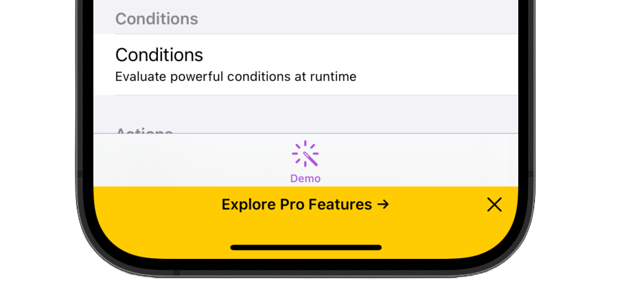
A banner offers users an option to explore your paid offering without interrupting the rest of your app's UI. Banners are easy to dismiss if the user isn't interested.
This template includes a pro_banner action which shows a dismissible
banner, linking to your paywall.
To enable the conversion banner UI:
- Add a deep link to your paywall using
iOS in-app links, and set the link in the
paywallActionaction to this deep link URL. Alternatively, this can be a web link to your pricing page if you allow web-based conversions as opposed to in-app purchases. - Set the
has_paid_subscriptionproperty in code, so you don't ask users who already subscribe to upgrade. - Optionally, update the
showProBannertrigger to control when and how often this announcement is shown. The current example presents it to unpaid users on every 3rd launch. However, you can update this to any logic you like.
Announcements With Banners and Embedded Browser
Sometimes you need to make important announcements to your users, such as brand updates, regulatory policy compliance, or pricing changes.
Critical Moments offers powerful in-app messaging capabilities with various methods to communicate with your users like banners, modals, web links, and alerts.
This template includes an announcement_banner and
announcement_info_action utilizing a
native banner UI
alongside an
in-app embedded browser
to make announcements to users.
To enable this announcement:
- Update the string in
announcement_bannerwith a short description of the announcement. - Update the link in
announcement_info_actionwith a web URL providing more info about the announcement. - Update the
banner_announcement_triggerto control when and how often this announcement is shown. The current example checks a specific date range and will only show it once by checking eventCount. However, you can update this to any logic you like.
Announcements With Native UI
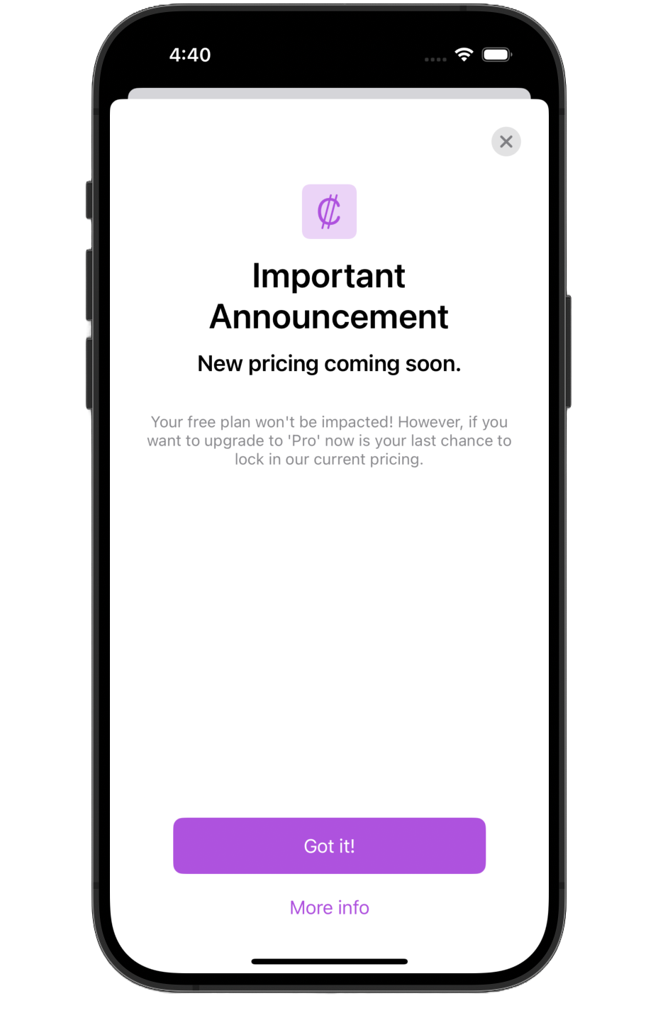
You can also make an announcement using our native modal UI. You can combine text, images, and links with fully native pixel-perfect rendering.
The template includes an announcement_modal with an example content,
which you can update as needed:
To enable this announcement:
- Update the content of
announcement_modalwith the correct strings and images for your announcement. - Update the link in
announcement_info_actionwith a web URL providing more info about the announcement, or delete theMore infobutton fromannouncement_modalif no web URL is needed.
Request Users Update their App if on an Old or Buggy Release
Bad app releases happen. Sometimes an ugly bug makes it past QA and into users' hands. Other times, an API you depend on is deprecated. In such cases, you're likelier to receive an influx of negative reviews and canceled subscriptions.
Critical Moments can ask impacted users to upgrade to the latest app version from the app store. You can target who sees the message by checking their app version, or even target it to only show for impacted users (e.g. a bug that only occures on iPads, or on iOS 17 or older). You can update this logic over the air, anytime, without app updates.
The template includes two versions: requestAppUpdate which allows
users to bypass, and
forceAppUpdate which forces users to upgrade.
To enable app update requests:
- Update the app ID in
update_app_actionwith your app ID and ensure the URL will launch to your app store page when tapped. - Decide whether you want to force users to upgrade or simply request they
do. Each has a separate trigger:
requestAppUpdateandforceAppUpdate. - Add the buggy release versions (e.g.,
'1.4.3') in the array in the condition withinrequestAppUpdateorforceAppUpdate. This will request an app update for specific version numbers. - Set a minimum app version in the
versionLessThancondition check withinrequestAppUpdateandforceAppUpdateto request an update for any app version number below the minimum. - Optional: Is the release only buggy on certain devices, like iPads but not iPhones, or only on older iOS versions? Update the condition to only display the message to impacted users using our rich targeting system.
“What's New” UI After Major App Updates
After a major update, it can be helpful to inform users about new features in your app. This is especially helpful if there are design or layout changes, as users can react negatively to change without warning.
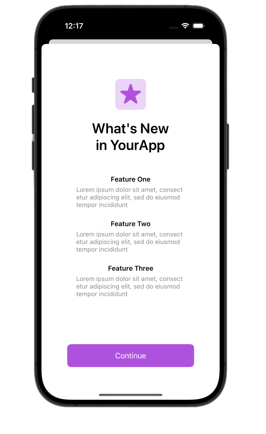
This feature is implemented in the sample config via
whats_new_modal and whatsNewTrigger.
To enable the "What's New" UI:
- Update the content of
whats_new_modalto describe your app's update. - Update the
whatsNewTriggerapp version and date conditions to ensure only users who updated to the appropriate version see it.
Remote User Messaging During Service Outages
Server outages happen, and when they do, apps can be inundated with negative reviews and customer support requests.
A proactive in-app message, shown before users encounter broken features, can help mitigate negative reviews and reduce customer service inquiries. Since the CM config is hosted separately from your API, it can be updated even when other services are down.
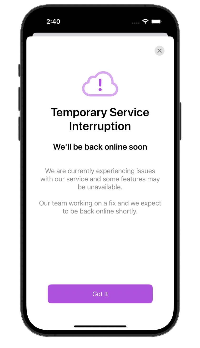
The template includes outage_warning and
outage_trigger.
To enable outage messaging:
- When an outage is occurring, set the condition in
outage_triggertotrueand update your config file over the air using remote update. - When the outage is over, set the condition in
outage_triggertofalseand update your config file over the air using remote update.
Smart Feature Flags
Critical Moments allows you to create feature flags that can be updated over the air.
Going beyonde standard feature flags, Critical Moments Smart Feature Flags allow you to update the state of a flag based on the user's realtime context. For example, a flag might be true only if the battery is > 20%, or even based on the weather where the user is!
To use smart feature flags:
- Add your feature flag to the
conditionssection of the config. There's an exampleexampleFeatureFlagIsNewPhoneflag in the template you can start with. - Use the feature flags in your code by calling the checkNamedCondition API.
Theme UI to Match your Brand
If you've used any UI from the sections above, you might want to update the
theme to match your brand's colors and fonts. The default theme, named
system, resembles Apple's native UI and will use your app's
accent color if it is set.
You can either create a completely custom theme or choose from one of our 21 built-in themes.
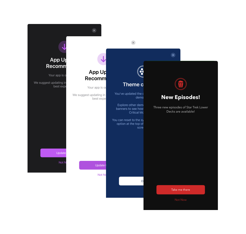
To implement themes:
- Follow the instructions in the
themessection of the config to create a custom theme, or set thedefaultThemeNameto one of the built-in themes.
See the themes docs for more information.
Get Creative
Our template is just a starting point. Feel free to experiment and adjust it to align with your unique brand identity. The possibilities are endless, so get creative!
Get Started
Ready to dive in? Follow our quick start guide, and you'll be enabling toolbox features in no time.
Over time you'll find more and more reasons to use Critical Moments in your app.

